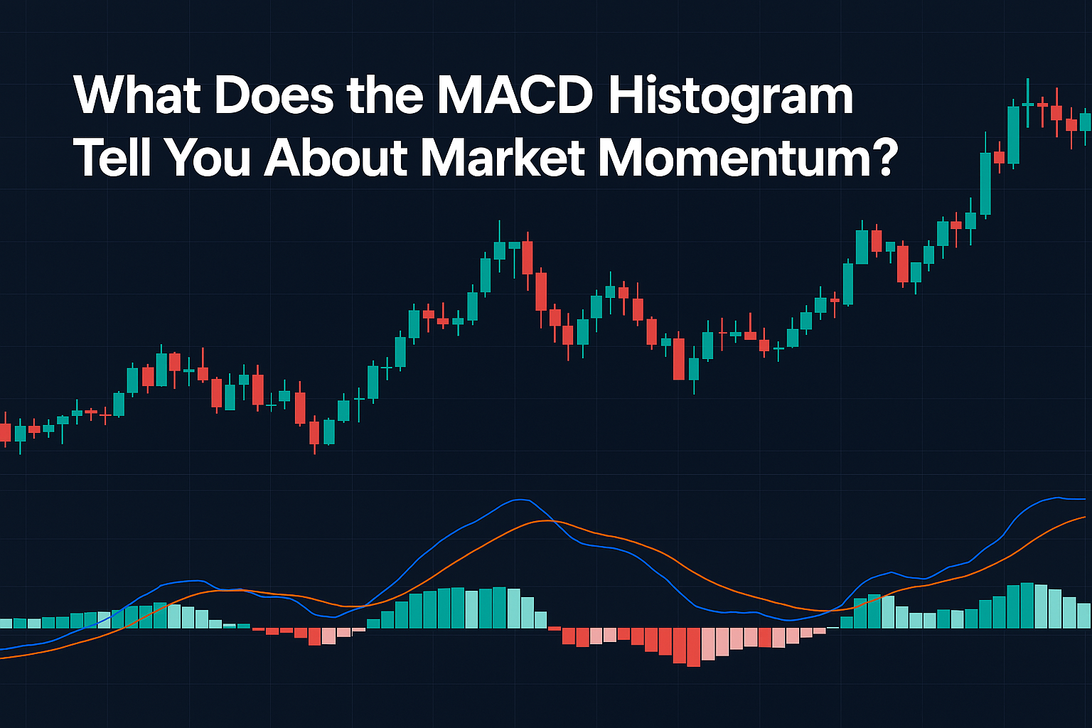
The MACD histogram is a visual tool that helps traders understand the strength and direction of market momentum. While the MACD line and signal line are used to identify crossovers and potential entry points, the histogram adds a layer of insight by showing the distance between these two lines.
What is the MACD Histogram?
The MACD histogram represents the difference between the MACD line and the signal line:
- Histogram = MACD Line – Signal Line
It is displayed as vertical bars above or below a zero line:
- Bars above the zero line indicate bullish momentum (MACD > Signal Line).
- Bars below the zero line indicate bearish momentum (MACD < Signal Line).
Interpreting the Histogram
1. Increasing Histogram Bars (Momentum Strengthening)
- When the bars grow taller, it shows that momentum in the current trend (bullish or bearish) is increasing.
- For example, rising bars above the zero line mean buyers are gaining strength.
2. Decreasing Histogram Bars (Momentum Weakening)
- Shrinking bars suggest the current trend is losing strength, even if price continues in the same direction.
- For instance, shrinking bars above the zero line may indicate the uptrend is fading.
3. Histogram Crosses the Zero Line
- A crossover from below to above the zero line can signal the beginning of bullish momentum.
- A crossover from above to below the zero line suggests bearish momentum may be starting.
(Insert chart showing expanding and contracting histogram bars with annotations)
Using the Histogram in Trading
Spotting Early Momentum Shifts
The histogram can reveal momentum changes before the MACD crossover occurs. Shrinking bars may warn that the crossover is near.
Confirming Breakouts
If a price breaks out of a resistance level and the histogram is expanding upward, it strengthens the breakout’s credibility.
Filtering False Signals
A histogram that remains flat or weak during a crossover may indicate a false signal. Wait for strong histogram expansion before acting.
Example: Histogram Warning Before a Reversal
Imagine Ethereum is rising, but the MACD histogram bars are shrinking despite price making new highs. This bearish divergence warns that momentum is weakening and a reversal could be near.
FAQs About the MACD Histogram
1. Is the histogram better than the MACD line?
Not better—just different. The histogram helps visualize momentum strength, while the MACD line gives specific crossover signals.
2. How soon does the histogram signal a momentum shift?
Often before the MACD crossover happens, giving you an early warning.
3. Can the histogram be used alone to trade?
It’s best used with the MACD line, signal line, and other indicators like RSI.
4. What does it mean when the histogram is flat?
Flat bars suggest indecision or very low momentum—wait for confirmation before trading.
5. Do histogram patterns work across all timeframes?
Yes, but they tend to be more reliable on higher timeframes.
Conclusion
The MACD histogram is a powerful visual tool that offers valuable insight into market momentum. By learning to interpret its patterns—expanding, contracting, and crossing the zero line—you can anticipate shifts in momentum and improve the timing of your trades. Always use it as part of a broader trading strategy for best results.


